Playbook
Life Insurance Agent Website: Wrong for Final Expense Buyers
A 34 year old comparing term quotes and a 74 year old pricing a burial policy are not the same visitor, and most agency websites only ever built a page for one of them.


18 min read
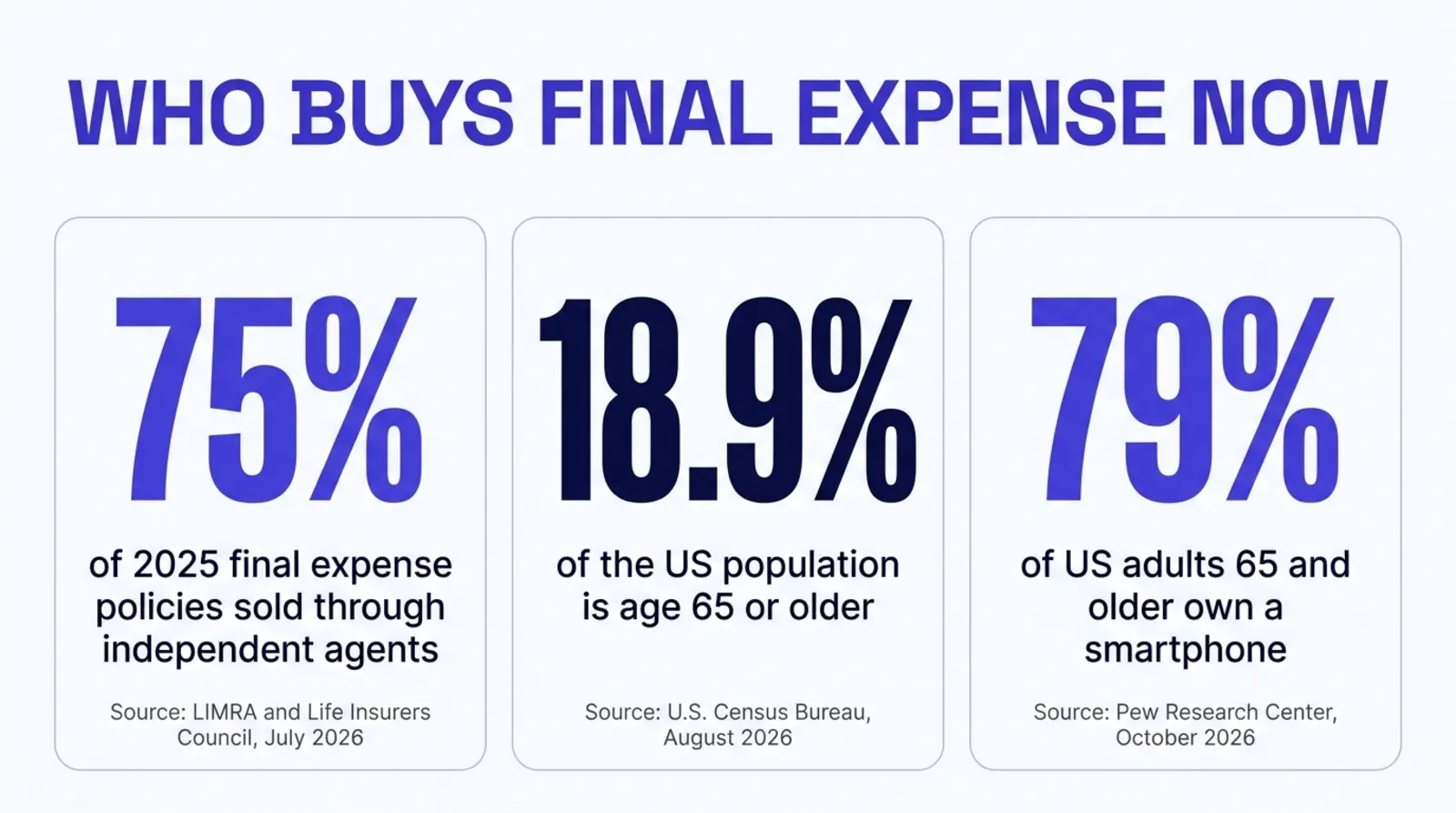
A final expense shopper is not the same visitor as a term or whole life shopper, and a website built for one loses the other. Independent agents and brokers sold 75% of final expense policies in 2025, the product itself runs small, simplified-issue face amounts averaging $15,3441, and the buyer is disproportionately part of the 18.9% of the US population that is 65 or older2, 79% of whom now carry a smartphone3. A page written for a younger buyer comparing term coverage, with an exam mentioned up top, a long quote form, and small body text, is answering questions this visitor did not ask and failing the ones they did. The fix is a dedicated page, built around what this specific buyer actually needs to see, fast enough to clear Google's own Core Web Vitals thresholds45 on the device this visitor is most likely holding.
One page, two completely different buyers
Picture two people landing on the same agency website this week. The first is 34, just put an offer on a house, and is typing "term life insurance quote" into a search bar on a laptop during a lunch break. The second is 74, lives on a fixed Social Security check, and is typing "burial insurance no exam" into a phone after a neighbor's funeral made the question feel urgent. Most agency sites hand both of these people the exact same page.
That page is usually titled something like "Life Insurance" or "Our Products," and it tries to do one job for both visitors at once: explain term, explain whole life, explain final expense, maybe mention universal life, all in a few paragraphs with a single generic "Get a Quote" button at the bottom. It is not a bad page because it is poorly written. It is a bad page because it is trying to be two pages, and a visitor who scans it for four seconds and does not see their own situation reflected back at them leaves and tries the next search result.
This guide is about the second visitor, the final expense shopper, because that buyer's needs differ from a term or whole life buyer's in ways that are easy to miss if you have never built a page specifically for them. The fix is not complicated. It requires treating final expense as its own line of business with its own page, the same way a Medicare page and an ACA page should never share space, and then building that page around what this specific visitor actually needs to see, in the order they need to see it.
A quick way to check your own site
Open your agency's life insurance page on your phone. Count the seconds until a number, any number, a price range, a face amount, something concrete, appears on screen. If it takes longer than a few seconds of scrolling past general language about "protecting your family," a final expense shopper has likely already left.
Who is actually buying final expense right now
The final expense market is not a niche footnote inside life insurance anymore, and the 2025 numbers make the case better than a general description would. The LIMRA and Life Insurers Council Final Expense Survey, published July 30, 2026, covering sales reported by 30 participating carriers, found total new annualized premium reached $1.38 billion in 2025, up 32% year over year, on 1.3 million policies sold, up 25%1. That is not a shrinking product line. It is one growing faster than the carriers writing it expected.
The distribution channel matters directly to anyone reading this on an agency website: independent agents and brokers accounted for 75% of the policies sold in 2025, affiliated distribution accounted for 20%, and direct-to-consumer channels, meaning a buyer completing the entire purchase online with no agent involved, accounted for just 5%1. This is still an agent-mediated sale. A website's job is not to replace the agent. It is to get the right visitor to pick up the phone, or to fill out a short form, instead of bouncing to a competitor's site that made the next step feel less confusing.
The age data explains why this visitor behaves differently once they reach the page. The US Census Bureau's August 2026 release put 18.9% of the US population at age 65 or older as of 2025, projected to reach 23.4% by 20602. Final expense is not exclusively sold to this age group, but it skews heavily toward it, because the product's entire premise, a modest policy sized to cover a funeral rather than replace decades of income, matches a buyer closer to the end of a working life than the start of one.
And this visitor is online. Pew Research Center's mobile technology fact sheet, updated October 19, 2026 from a survey fielded January 30 through June 18, 2026, found that 79% of US adults 65 and older now own a smartphone, with 96% owning some kind of cellphone and only 14% carrying a non-smartphone device3. The assumption that an older buyer is harder to reach online, or will call instead of browsing, is increasingly wrong. The more accurate assumption is that this buyer is on a phone, has less patience for a page that fights them, and is comparing your site against however many others show up in the same search.
Why a generic life insurance page loses this visitor
The mismatch is not one big mistake. It is a handful of small ones, each individually minor, that compound into a page this buyer does not trust or does not finish reading.
Start with the headline. A generic life insurance page usually opens with something like "Protect Your Family's Future" over a photo of a young couple with children. A final expense shopper reading that headline has to do translation work: does this apply to me, a person without young kids at home, shopping for something closer to a funeral policy than an income-replacement policy? Most visitors will not do that translation work. They will assume the page is not for them and leave.
Next is the underwriting language, or the lack of it. Term and whole life pages often mention a medical exam somewhere, because exam-based underwriting is common for larger term policies. A final expense shopper's biggest unspoken worry is usually "will I even qualify," often because a health condition or a prior decline makes them assume the answer is no. The LIMRA and Life Insurers Council survey found simplified-issue policies, meaning a short health questionnaire and no exam, made up 76% of 2025 final expense sales, and guaranteed-issue policies, meaning no health questions at all, made up the other 24%1. If a page never says this plainly, in the first screen a visitor sees, it is leaving the single most persuasive fact about the product unused.
Then there is the form. A long, multi-step quote form built for a term policy, asking for height, weight, tobacco use, family medical history, and a desired coverage amount up to a million dollars, is intimidating to fill out on a phone with a face amount question that tops out at $15,344 on average1. A shorter form, or a simple call-first path, matches how small and straightforward this specific purchase actually is.
Finally there is the reading experience itself. Small body text, low contrast gray-on-white paragraphs, and buttons sized for a younger thumb are tolerable friction for a 34 year old buyer in a hurry. For a 74 year old visitor, especially one who may have some vision or dexterity change that comes with age, that same friction is often the actual reason they leave, not a lack of interest in the product.
None of this is about talking down to an older visitor
Larger text, a shorter form, and plain language about qualifying are not a simplified or condescending version of a real insurance page. They are what a page built around the actual buyer looks like, the same way a Medicare page built around a 67 year old shopping Medicare Advantage plans looks different from a page built around a 40 year old shopping ACA coverage. Matching the page to the buyer is good design, not a compromise.
What the mismatch actually costs
There is no sourced, agency-wide bounce rate for "final expense visitors on a mismatched life insurance page" that this guide is going to invent, because no primary source publishes one. What can be stated honestly is the shape of the cost, built from numbers that are sourced.
Independent agents and brokers are already capturing 75% of final expense policy sales1, which means the channel this guide is written for is the dominant one, not a shrinking one. The opportunity is not whether final expense shoppers are buying through agents. They clearly are. The opportunity is which agent's page they land on and trust enough to act on, out of however many agency sites a search for "final expense insurance" or "burial insurance" returns in a given city or county.
The cost shows up in two places. The first is the visitor who leaves the page without converting, which this guide cannot quantify with an invented percentage, but which every agent who has watched their own analytics knows is real: a visitor who arrives, scrolls, and exits without calling or filling out a form. The second is slower and less visible: a page that never earns a return visit or a referral, because the visitor's actual experience, confusing form, unclear pricing, text too small to read comfortably, never gave them a reason to trust the agency enough to recommend it to the friend who asked where they got their policy.
The second cost compounds in a way the first does not. A final expense buyer is, almost by definition, someone talking to peers in a similar life stage, at a senior center, a church group, a family gathering, about exactly this kind of decision. A page that converts well on the first visit is also a page more likely to get mentioned by name in that conversation. A page that loses the visitor in the first ten seconds never gets the chance.
What a final expense page actually needs
None of what follows requires hiring anyone to understand. It is a checklist of what changes when a page is built around this specific buyer instead of a generic life insurance shopper.
Its own page, not a section. Final expense needs a dedicated URL, not a heading halfway down a combined "Life Insurance" page. A dedicated page can carry its own title tag, its own first hundred words answering the visitor's actual question, and its own internal links, all of which a shared page dilutes across multiple buyers at once.
A headline this buyer recognizes immediately. Lead with the actual need: coverage to handle funeral and final expenses, not family income replacement. A visitor should be able to read the first sentence on the page and know within two seconds whether they are in the right place.
The qualifying question answered before anyone asks it. State plainly, early on the page, that most final expense coverage is simplified issue, meaning a short set of health questions and no medical exam, or guaranteed issue, meaning no health questions at all. That single fact, sourced directly from how the product is actually underwritten, removes the single biggest reason a worried visitor hesitates to continue.
A realistic price range shown early, not buried behind a form. Use sourced industry figures as an honest reference point rather than inventing a quote. The 2025 LIMRA and Life Insurers Council data put average face amounts at $15,344 for simplified-issue policies and $11,299 for guaranteed-issue policies1, which is useful context for a visitor trying to understand roughly what coverage amount is typical before they talk to an agent about their own premium.
A short form, or a call-first path. Match the form's length to the product's simplicity. A ten-field underwriting questionnaire belongs behind a licensed agent's conversation, not in front of it. A short initial form, name, phone, a rough coverage goal, gets a visitor talking to a human faster, which is where a simplified-issue or guaranteed-issue sale actually closes.
Larger text and bigger tap targets than you might default to. This is not about building a separate, dumbed-down page. It is about setting body text and button sizes with a 65 and older audience's real device usage in mind, since Pew's own 2026 data shows this group is overwhelmingly on a smartphone3, not necessarily the newest or largest one.
A real local presence. A phone number in the header that is actually answered, a real photo of the agent, and a license number or state disclosure visible without hunting for it. Trust signals matter more to a buyer who has less tolerance for anything that feels like a lead-gen funnel built to be sold off to a call center.
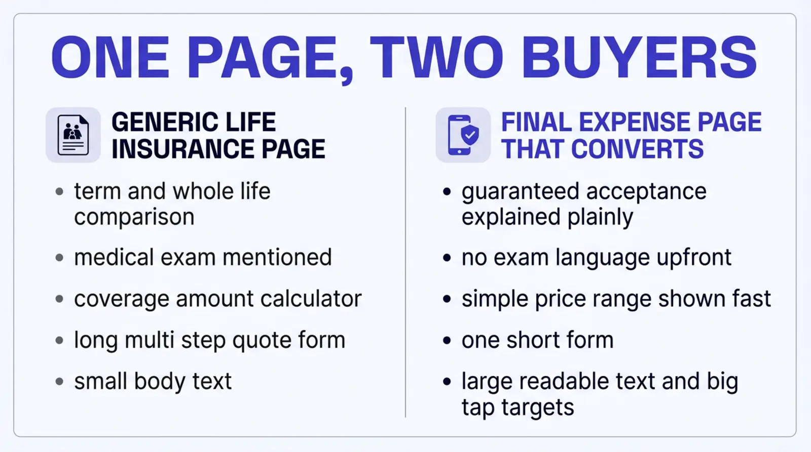
The same agency, two different pages
Put two versions of the same agency side by side and the difference stops being theoretical. Both versions represent a composite, independent, multi-line agency writing Medicare, ACA, life, and final expense, the kind this guide is written for, not a specific client.
Version one has a single "Life Insurance" page under the main navigation. The headline reads "Protect What Matters Most," above a stock photo of a young family on a porch. Below it, three paragraphs explain term life, whole life, and final expense in roughly equal space, each a few sentences long. A "Get a Quote" button opens a six-field form asking for date of birth, desired coverage amount, tobacco use, height and weight, and a preferred contact time. Nowhere on the page does a number appear until after that form is submitted. The text runs at a standard 16 pixels, and the buttons are sized for a younger visitor who is used to small mobile targets.
A 74 year old visitor who searches "burial insurance no exam" and lands on this page has to read past two paragraphs that do not apply to her before reaching one that might, then fill out a form built for a much larger, medically underwritten policy, before learning anything about price. Many visitors in that position do not finish the form. Some do not finish the page.
Version two gives final expense its own page, linked from the main navigation by name, not buried under a generic "Life Insurance" dropdown. The headline reads "Final Expense Coverage to Protect Your Family From Funeral Costs," with a subhead stating plainly that most applicants qualify with no medical exam. Within the first screen, a short paragraph gives a realistic face amount range, framed around the kind of coverage most final expense buyers actually carry, sourced to the industry figures this guide cites rather than invented. The call to action is a short, three-field form, name, phone, and a general sense of coverage goal, next to a visible phone number. Body text runs larger than the site's default, and every tap target is sized generously.
The same visitor lands on version two, reads a headline that matches her actual situation, sees a number she can react to within seconds, and reaches a form that takes under a minute to complete on a phone. Nothing about the underlying product changed between the two versions. Nothing about the agency's licensing, carriers, or pricing changed either. The only thing that changed is whether the page was built around this visitor or around a generic life insurance shopper who happened to share the same URL.
Why mobile speed matters more for this buyer, not less
There is a common assumption that an older visitor is less sensitive to page speed, maybe even using a desktop more than a phone, so speed optimization matters less for this audience than for a younger one. The 2026 data says the opposite. Pew's fact sheet shows 79% smartphone ownership among US adults 65 and older3, and the Census Bureau's own figures put nearly one in five Americans in that age bracket2. This is a mobile-heavy audience, arriving on whatever phone they own, not necessarily the latest model on the fastest connection.
Google's own Search Central documentation, fetched for this guide, defines a good Largest Contentful Paint as 2.5 seconds or less, a good Interaction to Next Paint as 200 milliseconds or less, and a good Cumulative Layout Shift as 0.1 or less, and states that page experience "aligns with what our core ranking systems seek to reward"4. Google's web.dev documentation adds that these thresholds are measured at the 75th percentile of real visits, segmented across mobile and desktop separately5. A page assembled by a page-builder's runtime, loading a visual editor's JavaScript before the content finishes rendering, has more weight to clear those thresholds with on a mid-range phone than a page that ships as finished HTML.
None of this means an older visitor cannot use a slower page. It means the margin for error is smaller. A 34 year old term shopper comparing a handful of large, important quotes will often wait out a slow page because the stakes feel high enough to justify the patience. A 74 year old comparing a modest monthly premium against whatever the next search result offers has less reason to wait, because the decision itself carries less perceived risk if they simply try the next site instead. We cover the mobile speed question in more depth, including what actually causes a slow load on an agency site, in why your insurance website fails Google's speed test.
Check it yourself before reading further
Run your own final expense or life insurance page through PageSpeed Insights, on the mobile tab specifically. If it scores comfortably above 90, speed is not where you are losing this visitor. If it does not, the rest of this guide's page-element fixes are competing against a page that is also fighting the visitor's patience before they finish reading your headline.
The generic page against the page built for this visitor
Laid out side by side, the differences are not stylistic preferences. Each one maps to a specific reason this specific visitor leaves, stays, or converts.
| Element | Generic life insurance page | Page built for final expense |
|---|---|---|
| Headline | "Protect Your Family's Future," aimed at income replacement | States the actual need: coverage for funeral and final expenses |
| Underwriting message | Exam mentioned or implied, or not addressed at all | States plainly that most coverage is simplified or guaranteed issue1 |
| Pricing | Hidden behind a multi-step form before any number appears | A realistic face amount range shown early, sourced to industry data1 |
| Form length | Built for a larger, exam-based term policy | Short, or a call-first path matched to a simpler product |
| Text and tap targets | Default theme sizing, not tested against an older visitor's device | Larger body text and bigger buttons, built for a 65-plus mobile audience3 |
| Mobile speed | Whatever the platform's runtime happens to deliver | Built to clear Google's own Core Web Vitals thresholds45 |
How we build the final expense page
We re-fetched our own Digital Foundation pricing page while writing this guide, the same standard this article holds every other figure to. The Website tier runs $84 a month billed annually ($1,008 a year), and ships a complete site with 30 pages live on launch day, built around the agency's actual lines of business rather than a generic local-business template6. For an agency writing final expense alongside Medicare, ACA, or other life products, that means a dedicated final expense page from the start, not a shared services page retrofitted later.
We build on Astro, which ships zero JavaScript to the browser by default, so a page arrives as finished HTML instead of a page-builder runtime your visitor's phone has to download and boot before anything appears. Our builds score 90 or higher on Lighthouse performance on both mobile and desktop, and some score 100. From the Website tier, Starter at $247 a month adds a weekly publishing cadence and Google Business Profile management, Pro at $497 adds up to 17 new pages a month and a 24/7 AI voice receptionist, and Scale at $997 scales content to roughly one new page a business day6.
None of that is a reason a final expense page built elsewhere cannot also follow the checklist above. The page elements in this guide, a dedicated page, an early price range, plain underwriting language, a short form, larger text, and a fast mobile load, are not proprietary. They are what a page built around this specific buyer looks like, on any platform willing to build it that way.
If you want a second set of eyes on your current page
The free Audit scores your current site for speed, AI citation readiness, and HIPAA safe tracking in about a minute, final expense page or not. It is a reasonable starting point before deciding whether to rebuild a page or simply fix the specific gaps this guide names. strategicaiarchitects.com/audit
What changes for your agency
None of this promises a specific lead count, a conversion rate, or a ranking position, because none of those can be honestly promised by anyone writing about a page they have not built and measured. What a page actually built around this visitor changes is more concrete than that.
A page this buyer recognizes
A headline, a price range, and underwriting language that answers what a final expense shopper is actually worried about, in the first screen.
A form sized to the product
A short path to a conversation instead of a long underwriting questionnaire built for a different kind of policy.
A page built for the device it will actually load on
Larger text, bigger tap targets, and a fast mobile load, matched to how this audience actually browses in 2026.
A line of business that finally has its own page
Final expense separated from term and whole life, the same way Medicare and ACA deserve pages of their own.
Questions agents ask
What actually makes final expense insurance different from a regular life insurance policy?
Final expense is a small, permanent life insurance policy, usually with a face amount in the low five figures, sold specifically to cover burial, cremation, and other costs that land on a family right after a death. The LIMRA and Life Insurers Council survey of 2025 sales put the average face amount at $15,344 for simplified-issue policies and $11,299 for guaranteed-issue policies, well under the coverage amounts a term or whole life calculator on a typical agency homepage is built around. The buyer is not shopping to replace income or fund a mortgage. They are shopping to make sure the funeral bill does not become their adult child's problem.
Does a final expense buyer need a medical exam?
Most final expense products are sold as simplified issue, meaning a handful of health questions and no paramedical exam, or guaranteed issue, meaning no health questions at all, usually with a waiting period before the full death benefit applies. The LIMRA and Life Insurers Council survey found simplified-issue policies made up 76% of 2025 final expense sales, guaranteed-issue made up the other 24%, and exam-based underwriting was not a reported category. A page that leads with exam language, or that never clarifies there is no exam, is answering a question this buyer was not asking and failing to answer the one they were.
Why do final expense shoppers want to see a price before anything else?
Final expense buyers tend to be on a fixed income, and the entire pitch of the product is predictability: a set premium, a set benefit, no surprises. A page that makes the visitor fill out a four-field form before showing any number at all is asking for trust the page has not yet earned. The fix is not to quote an exact premium with no underwriting done, which no honest site can do. It is to show a realistic range early, tied to the face amounts carriers actually report, so the visitor has a number to react to before deciding whether to hand over contact information.
Should final expense live on the same page as term and whole life?
No, for the same reason a Medicare page should not share space with an ACA page. Each buyer is asking a different question, reading at a different pace, and often at a different point in life. Stacking final expense into a general life insurance services page forces the page to serve a 38 year old shopping for a term policy to protect a mortgage and a 72 year old shopping to cover a funeral, with one headline and one set of bullet points. Neither buyer gets a page that was actually written for them. We cover the broader architecture question, one page per line of business and why it converts better than a combined services page, in insurance agency website design: the pages that sell policies.
How big should the face amount be on a final expense page, and should the site quote exact premiums?
Use the real industry figures as a reference range rather than a quote. The 2025 LIMRA and Life Insurers Council survey reported average face amounts of $15,344 for simplified-issue policies and $11,299 for guaranteed-issue policies, which is a reasonable range to show a visitor so they know roughly where coverage amounts land before talking to an agent. An exact premium depends on age, health class, state, and carrier, so a page that prints one fixed dollar figure as if it applies to everyone is making a promise the underwriting has not made yet. Show the range, explain what moves it, and let the actual quote happen with a licensed agent.
Does a final expense page need to be mobile first, or is that true of every insurance page?
It matters more here, not less. Pew Research Center's mobile fact sheet, updated October 19, 2026 from a survey fielded through June 2026, found 79% of US adults age 65 and older own a smartphone, and the Census Bureau's August 2026 release put 18.9% of the US population at age 65 or older. Most of this visitor's traffic is going to arrive on a phone. The part that is different from a younger buyer is tolerance: a 34 year old comparing term quotes will often push through a clunky mobile layout because the dollar amounts at stake are large. A 74 year old comparing a $30 monthly premium against a competitor's page is far less likely to fight a page that makes them pinch to zoom.
What happens if I combine final expense with Medicare content on one page?
Beyond the same single-question problem described above, Medicare marketing carries its own disclaimer requirements under CMS rules that have nothing to do with final expense, which is ordinary life insurance, not a Medicare product. Mixing the two on one page risks either omitting a disclaimer that belongs there or printing one that does not apply, confusing both the visitor and, eventually, a compliance reviewer. Keep the lines separate. We go through what the CMS rules actually require on a Medicare-specific page in a related guide linked from the service architecture piece above.
How fast should a final expense agent's website load?
By the same standard as every other page: Google's own Search Central documentation, fetched for this guide, defines a good Largest Contentful Paint as 2.5 seconds or less, a good Interaction to Next Paint as 200 milliseconds or less, and a good Cumulative Layout Shift as 0.1 or less, each measured at the 75th percentile of real visits and segmented across mobile and desktop. Nothing about final expense changes those thresholds. What changes is how much room there is for error: a slower-than-average visitor, on an older device, with a lower tolerance for friction, is exactly the person a borderline score loses first.
Sources
- LIMRA and Life Insurers Council (LOMA). "Life Insurers Council: Final Expense Insurance New Annualized Premium Increased 32% in 2025." 2025 sales: $1.38 billion total new annualized premium (up 32% year over year), 1.3 million policies sold (up 25%), simplified-issue 76% of sales with average face amount $15,344, guaranteed-issue 24% with average face amount $11,299, independent distribution 75% of policies sold, affiliated 20%, direct-to-consumer 5%. Published July 30, 2026. Fetched live October 26, 2026. loma.org/en/news/press-releases/2026.
- U.S. Census Bureau. "Global Older Adult Population Projected to Nearly Double by 2060." 18.9% of the US population was age 65 or older in 2025, projected to reach 23.4% by 2060. Published August 31, 2026. Fetched live October 26, 2026. census.gov/newsroom/press-releases/2026.
- Pew Research Center. "Mobile Fact Sheet." Among US adults 65 and older: 79% own a smartphone, 96% own a cellphone of some kind, 14% have a cellphone but not a smartphone. Fact sheet dated October 19, 2026, survey fielded January 30 to June 18, 2026. Fetched live October 26, 2026. pewresearch.org/internet/fact-sheet/mobile.
- Google. "Understand and measure Core Web Vitals," Search Central Documentation: good thresholds of 2.5 seconds or less for Largest Contentful Paint, 200 milliseconds or less for Interaction to Next Paint, and 0.1 or less for Cumulative Layout Shift; page experience "aligns with what our core ranking systems seek to reward." Last updated 2025-12-10. Fetched live October 26, 2026. developers.google.com/search/docs/appearance/core-web-vitals.
- web.dev (Google). Core Web Vitals thresholds measured at the 75th percentile of page loads, segmented across mobile and desktop: LCP good is 2.5 seconds or less, INP good is 200 milliseconds or less, CLS good is 0.1 or less. Last updated October 31, 2024. Fetched live October 26, 2026. web.dev/articles/vitals.
- Strategic AI Architects. Digital Foundation service page: Website $84/mo billed annually ($1,008/yr, 30 pages live on launch day); Starter $247/mo (weekly publishing cadence, Google Business Profile management); Pro $497/mo (up to 17 new pages/mo, 24/7 AI voice receptionist); Scale $997/mo (roughly one new page per business day). Fetched live October 26, 2026. strategicaiarchitects.com/digital-foundation.
Talk it through
Want a second pair of eyes on it?
Free 30 minutes. Bring what you found, or bring nothing and we will look together at how AI engines read your site and which fixes move first.
See how your final expense page actually scores
Run a free Audit and see how your site scores on speed, AI citation readiness, and HIPAA safe tracking, in about a minute, whichever lines of business it currently tries to cover on one page.
Related reading: Insurance agency website design: pages that sell policies · Why your insurance website fails Google's speed test · Why AI search never names your final expense agency